A transformation of Adform - a SaaS B2B digital advertising platform - into Adform Flow, that received Red Dot and If Design Awards for User Experience and User Interface.
Image
I worked on this project in Adform, in 2020-2022 and was responsible for both leading the team and doing hands-on work - research, UX and UI design. I was also responsible the creation and maintenance of the Design System.
AdTech
User Journey Mapping
User Interviews
Usability Testing
Prototyping
UI Design
Design System
Figma
Figma Make
Sketch
Adform FLOW is an innovative platform for ad campaign management that enables collaboration across the entire workflow. Designed with a user-centric approach, it features a personalised, adaptive dashboard, which provides role-based permissions, unifies alerts and tasks, and displays data relevant to the respective context. The platform’s consistency is reflected not only in its stringent visual design but also in the processes. Thus, users can navigate intuitively through the system and manage their projects efficiently.
The users of Adform, who create and manage hundreds of campaigns and line items, are exposed to complex fragmented tools. In the old system there were many separated parts that users had to navigate - a campaign manager, the media tools, the marketplaces for audiences and inventories etc.
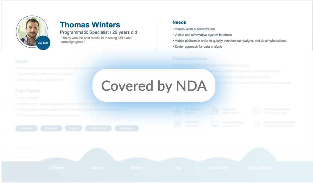
The project of complete Adform Platform redesign started with the research and exploration: 200+ interviews were conducted with ad operation specialists, programmatic specialists, media planners etc. Based on the interviews 12 persona profiles were created. The most popular persona profile was Thomas, the programmatic specialist:
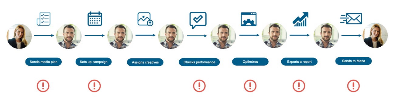
As a lead designer on this project, I introduced a new tool – the User Journey Map. It is based on 30+ interviews with programmatic specialists and is an outcome of brainstorming done with the design team, product directors and our SMEs. User Journey map provides an overview over the whole process instead of concentrating on specific steps in the workflow. It presents the current workflow, the steps in the process, the pain-points and the possible ways to solve it.
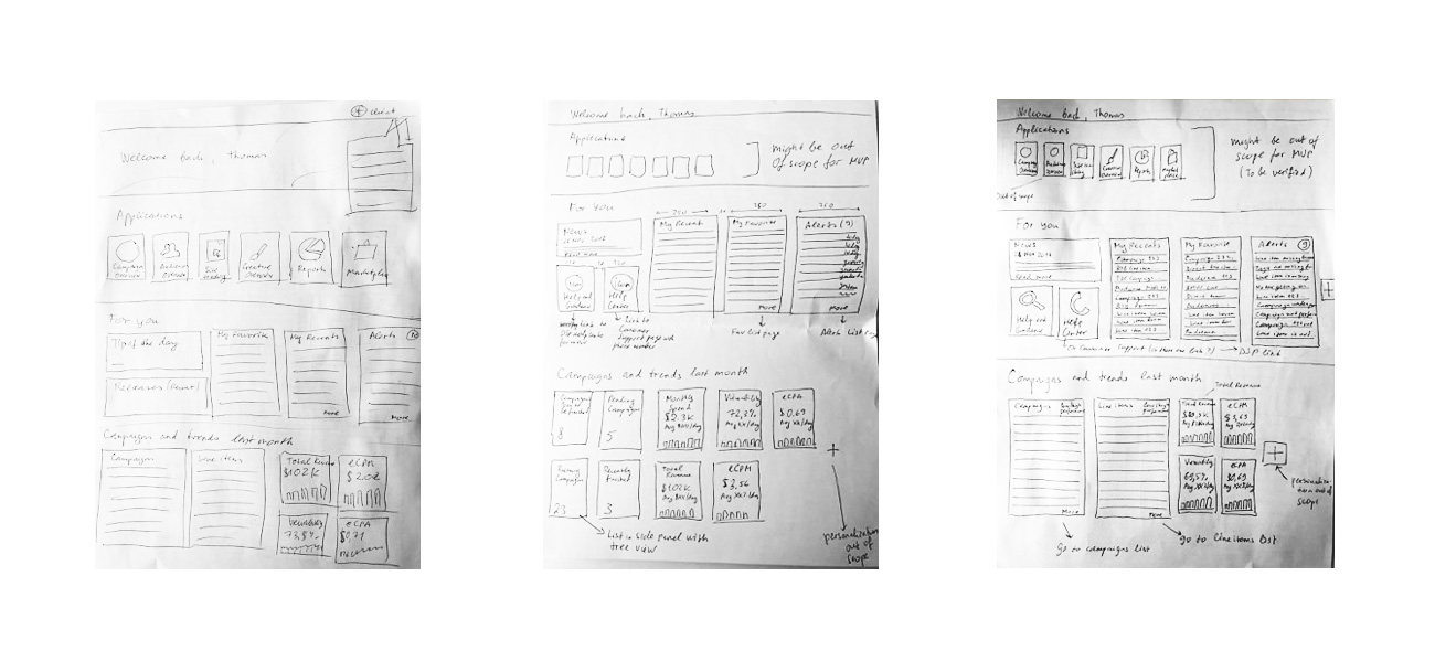
When User Journey Map was ready, we kicked off an ideation project together with Product Directors, SMEs, Software Architects, UX Researchers and Designers. The ideation project consisted of several brainstorming sessions followed by concept creation and validation rounds. Validation rounds with clients provided us with valuable feedback and showed the direction.
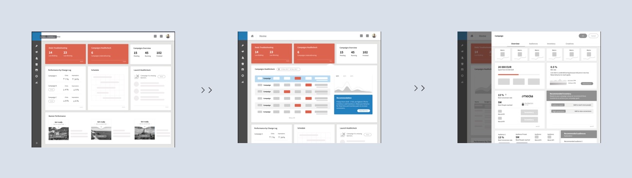
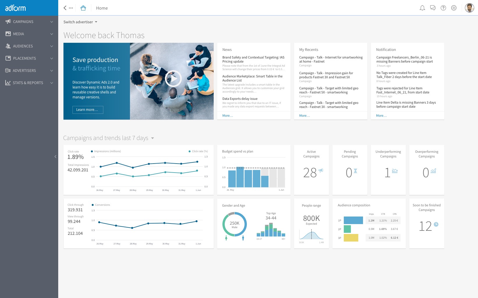
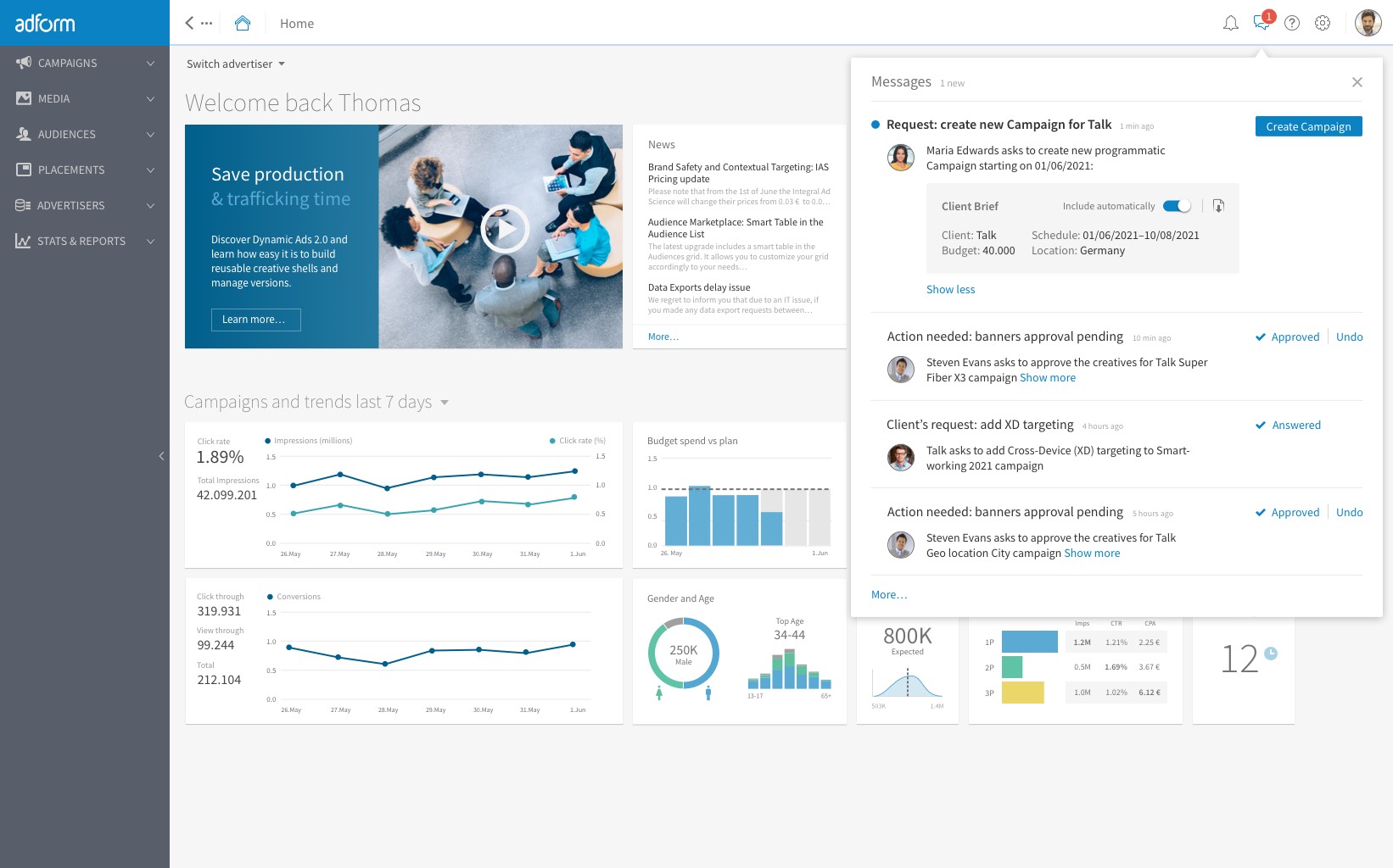
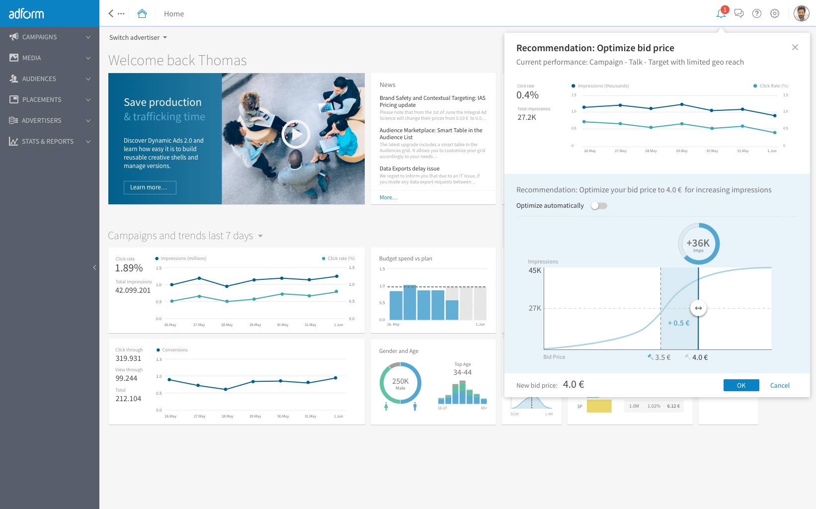
The first screen to start with is Personalized Home. Personalized Home is the first page a user sees after logging in to Adform. It offers the user an easy overview of what is of most interest to her and provides tools to effectively monitor on-going campaigns and perform needed optimizations based on real-time data and insights. Personalized home can be easily customized by selecting widgets that are most useful to the user.
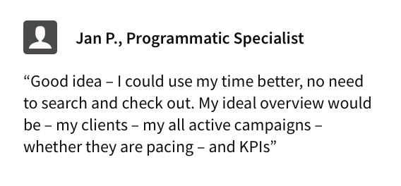
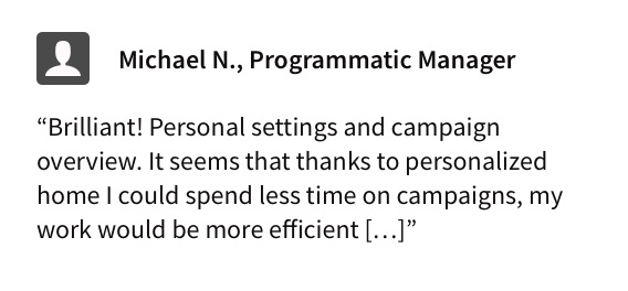
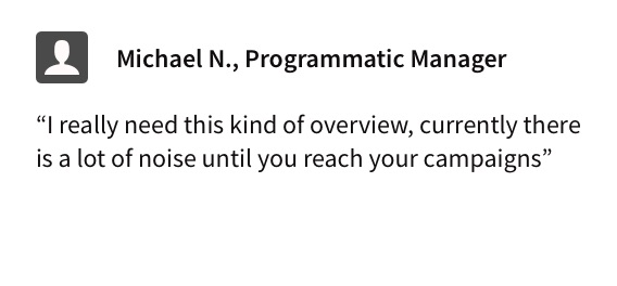
The first validation round confirmed that we were going in the right direction and helped to refine the concept. For example, clients stated they needed to have more data about campaigns, like underdelivering campaigns, examples of best running campaigns etc. While other items that were placed on first mocks (like deals troubleshooting) resulted in being unnecessary. The second validation round was conducted when hifi designs where ready, and brought additional input for adjusting widget arrangement and other details, for instance KPIs.
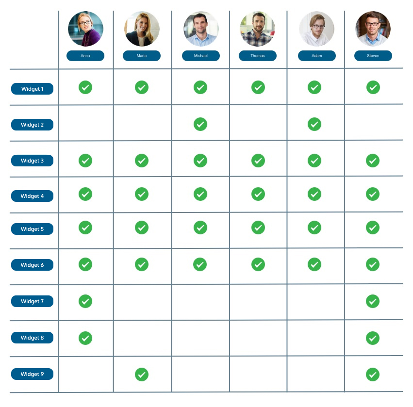
Content validation and prioritization of widgets in Personalized Home was done by creating a matrix with Personas and all possible widgets. The answers are based on interviews and persona cards. Widgets that got a higher "score" got a better position on the Home Page.
Two common scenarios for Programmatic Specialist will be described here, even if they are only only a fraction of all possible use-cases.
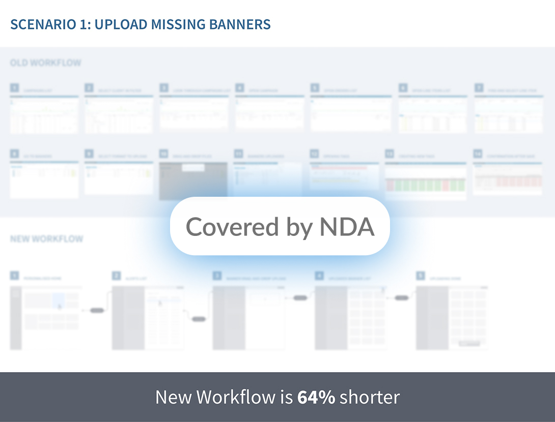
First Scenario shows a common error, when a strategy (a line item) is missing banners and therefore isn't running. We redesigned the workflow in a way, so that users can get notifications and do the action directly from the home page, resulting in a 64% step reduction.
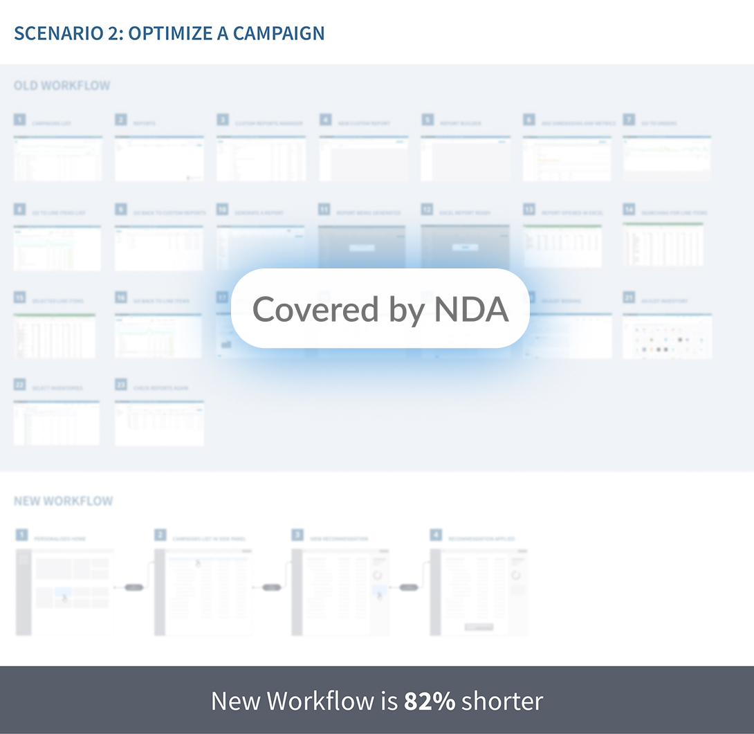
The second scenario shows the most time-consuming workflow for a Programmatic Specialist: campaign optimization workflow. We redesigned the workflow based on user feedback and careful analysis of actions that are needed. The redesigned workflow resulted in 82% step reduction.
We also explored possible scenarios for optimisation, recommendation and campaign creation by designing lo-fi mocks and creating prototypes as well as validating them.
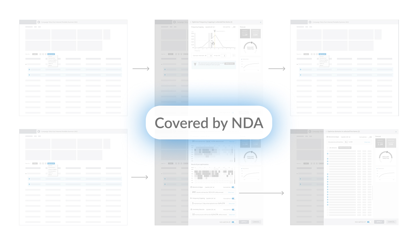
This is one of the early prototypes, showing the 2 scenarios – add missing banners and campaign optimization.
One of the aspects of this project was a complete redesign of platform look&feel. A color scheme was chosen that reflects stability and solidity of a B2B platform. A font with a good readability at all sizes was chosen. Animations and microinteractions were crafted for providing feedback to users and supporting every interaction.
The Personalized Home offers the user an easy overview of what is of most interest to her and provides tools to effectively monitor on-going campaigns and perform needed optimizations based on real-time data and insights. The Personalized home can be easily customized by selecting widgets that are most useful to the user.
Messages and notifications offer a significant improvement of users' workflow, by providing the possibility to take action directly from the message, that already contains the brief of the campaign.
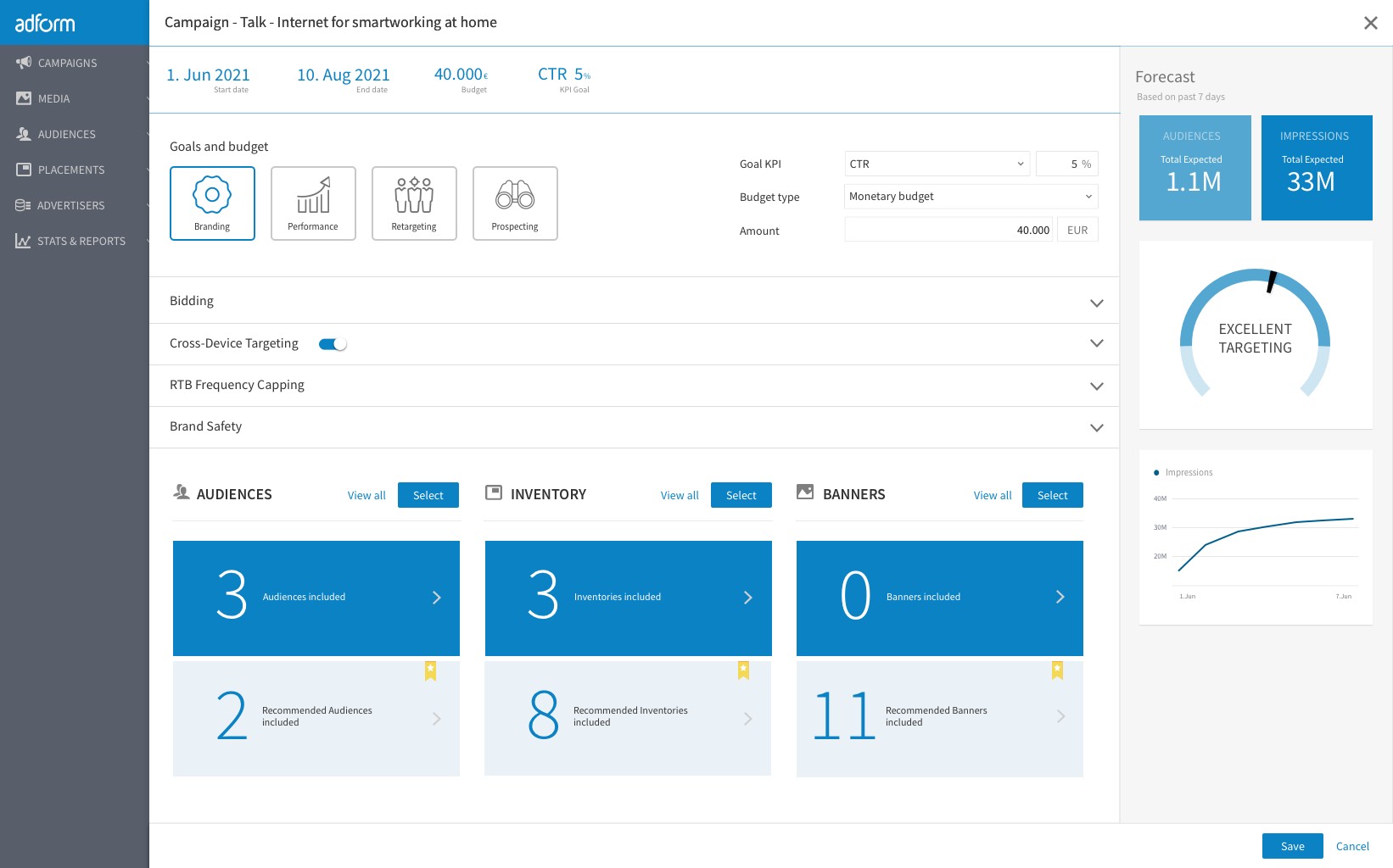
We provided pre-population functionality of the fields as well as redesigned completely the campaign creation page. Our aim was to present the most important settings by using progressive disclosure pattern and grouping of related settings.
We also redesigned the data visualization widgets, that now provide a much more clear and immediate feedback whether the targeting settings are good and what is the campaign forecast.
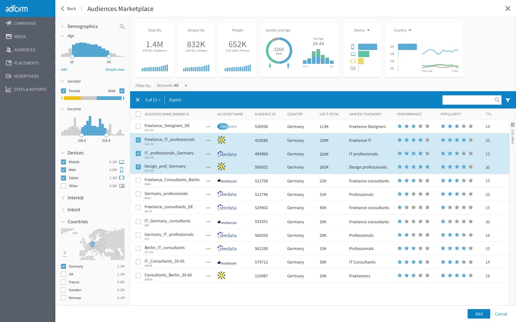
Audiences are pre-populated, so Thomas, the programmatic specialist, can check whether they correspond to the demographic data and fit well campaign's brief.
We used the progressive disclosure pattern for the inventory selection as well - most suitable inventories are already added to the settings based on demographic and other data from the brief, however, user can open the inventory marketplace and acquire new inventory without leaving the campaign setup.
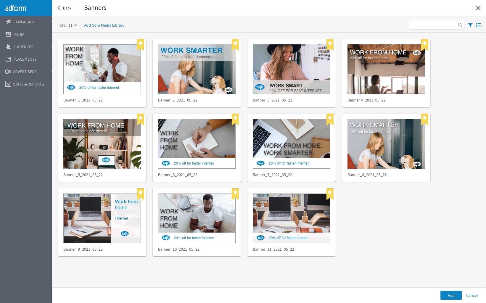
Banners are also recommended, based on previous campaigns and the brief from the co-worker.
After creating the campaign, back in the personalised Home, user sees a notification, that a campaign is underperforming. He/she can directly apply the recommendation and optimise the campaign.
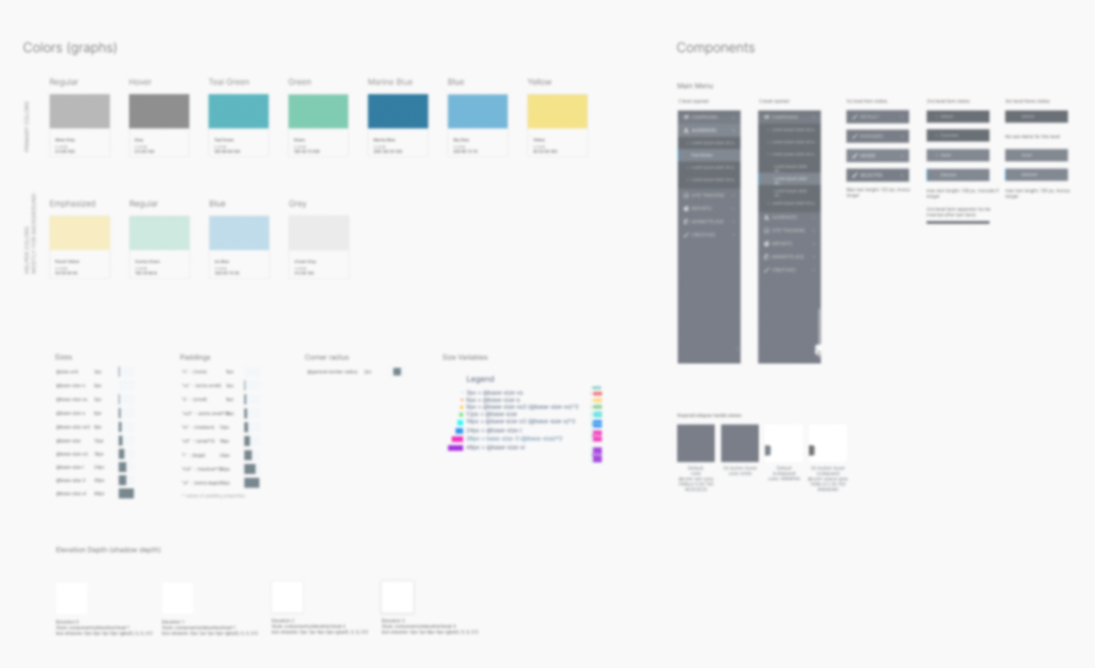
A new design library was created, containing all the colours, fonts, effects and components. The design system comprised interaction patterns, typical workflows, composite and simple components and application states.
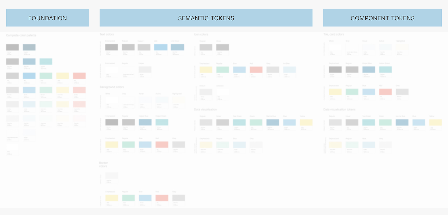
Based on the foundational visual concepts, we structured the design system's tokens hierarchically. We began with base and semantic tokens, then proceeded with defining the smallest elements: simple components and their corresponding tokens. This work included detailed specifications for sizes, paddings, corner radius, shadows, and more.
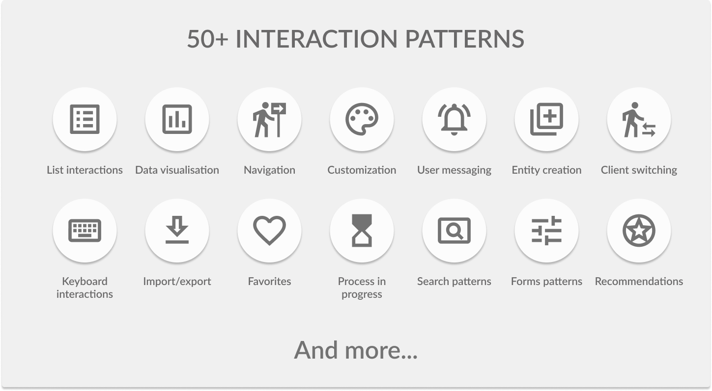
After defining the main page types and component/page templates, we established all core UX patterns. This comprehensive definition spanned everything from list behavior and user messaging to forms, recommendations, entity creation, navigation, and in-progress processes. The complete list ultimately comprised over 50 patterns.
Accordingly to 2022 PWC audit, the improved user workflows in Adform Flow, led to 24-60% efficiency gains.
The Adform Flow design was awarded with two awards and nominated for one:
1) Red Dot Award;
2) If Design Award;
3) Nominee for UX Design Awards.
Web site design Ana Rink © 2025