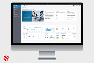
Mondadori Design System

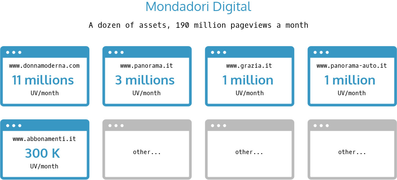
An attempt to standardize website production for Mondadori – largest italian publisher with a dozen of web portals and 190 millions monthly page views.

Image

Make the production of websites to a standardized and efficient process

The Team

User 1
User 2
User 3
User 4
User 5
User 5

The Challenge

The digital division of Mondadori assigned Prodigys Technology to design a standard wireframe system which resulted in redesign of some Mondadori’s websites.

Industry, my contribution and tools

Digital Publishing Quantitative data analysis User Interviews Usability Testing Prototyping Documentation Adobe Photoshop Adobe Illustrator Google Analytics Axure

My Role: Lead UX designer
Background

Mondadori is the largest publishing company in Italy, under direction of Fininvest holding (president Barbara Berlusconi). Mondadori Digital Unit has a dozen of web portals and millions of unique visitors. 
Research

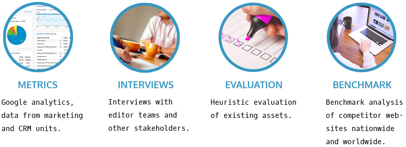
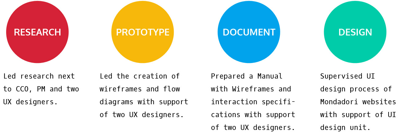
The research started with the heuristic evaluation of existing Mondadori websites, analysis of the data from Google analytics and marketing data, analysis of the Content Management System, interviews with editors and other stakeholders, benchmark analysis of competitors websites and search for best practices.

Reasearch process

Standardizing UX

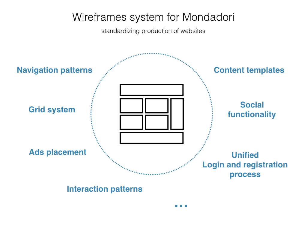
After research stage we started off designing a standard design system for Mondadori assets. It wasn’t only about layout structure, the redesign considered navigation, interaction patterns and processes like registering, commenting, login, social functionalities etc. 

Users

There were two types of users we were designing for: the editors who were posting articles and other content through CMS, and the users of the web portals. It was especially challenging to design a solution that would match everyone’s needs.

Grid System and Page Layout

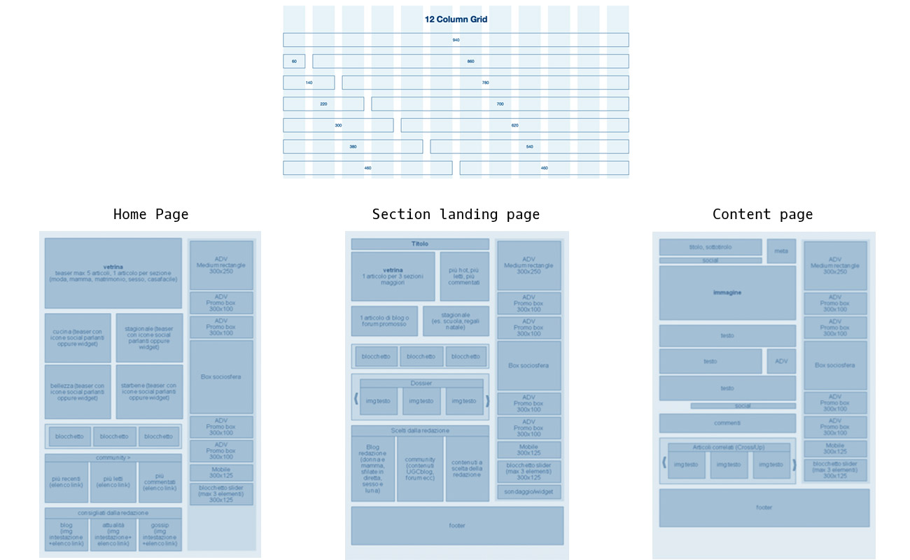
The 12 column grid system was chosen and a standardized layout was defined: the standard placement for ads, logo, subscription promotion, search box and other header elements, social functionality elements, login and register buttons, footer etc. Standard structural layouts were designed for all levels of navigation. 

Content blocks

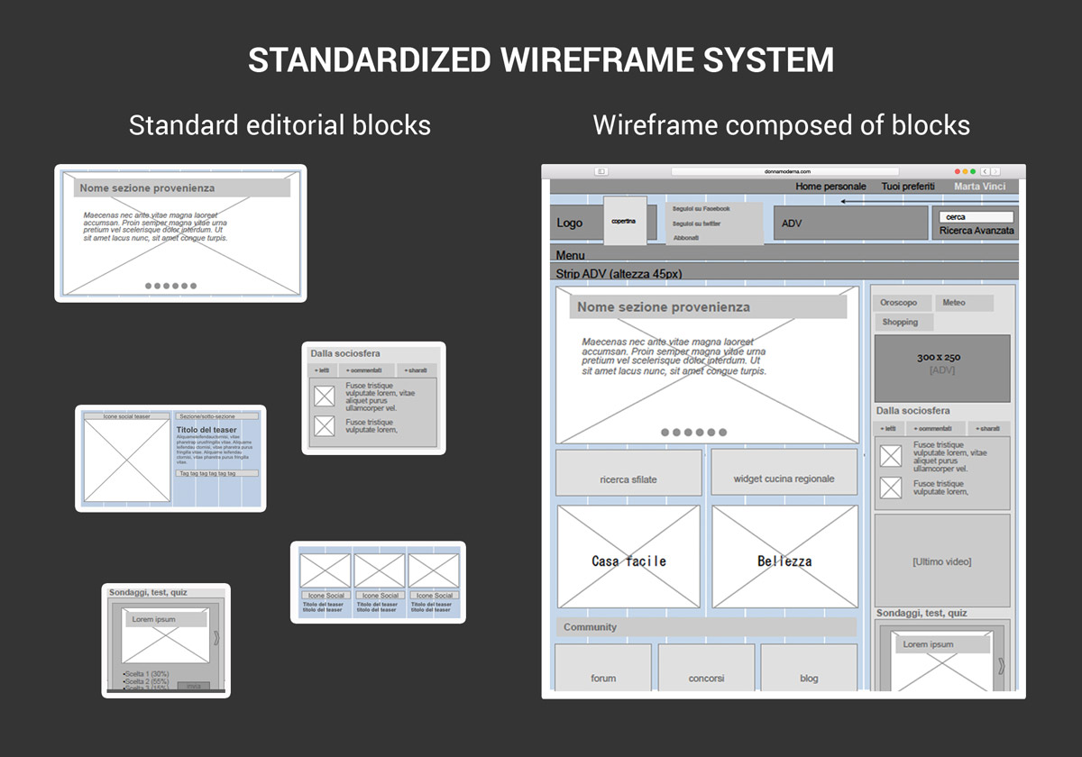
After analyzing 8+ websites of Mondadori, 20+ competitor websites and interviewing editors of several Mondadori’s online magazines we designed standard content blocks for all types of content, that would fit current and future editors' needs.

Documentation

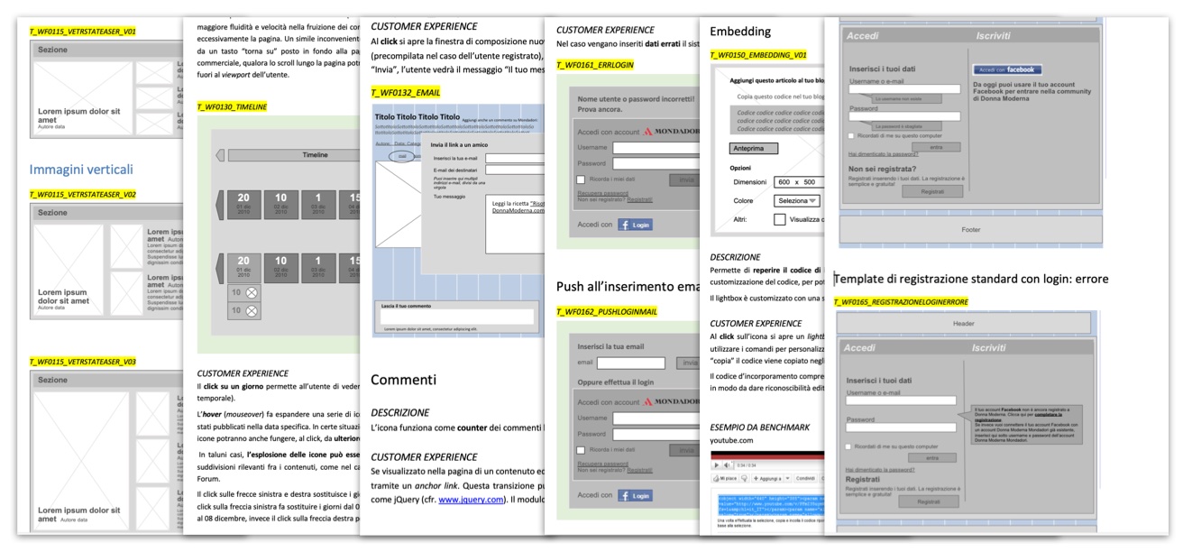
We produced a manual which described how different functionality blocks should be structured and act, how different processes like login/registration and social functionalities should work. The Wireframe Manual was uploaded to client's intranet system for easy access by all employees.

Prototyping and UI design

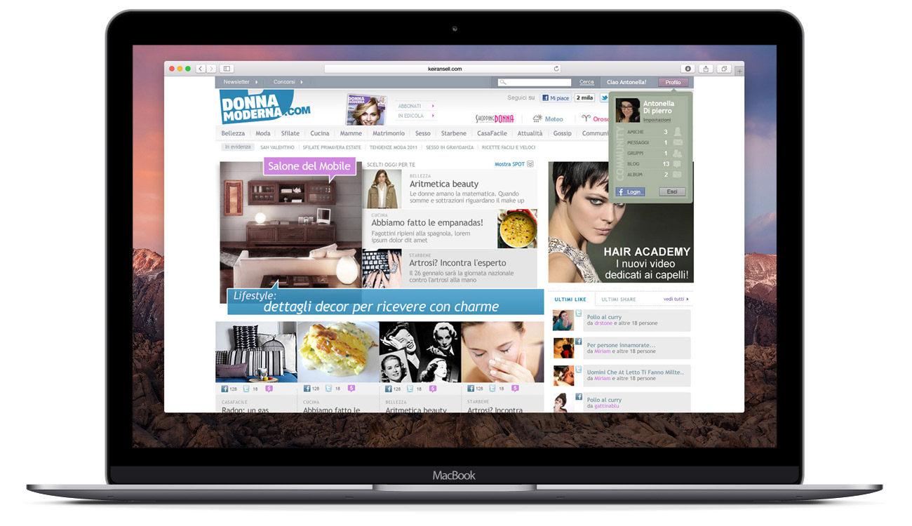
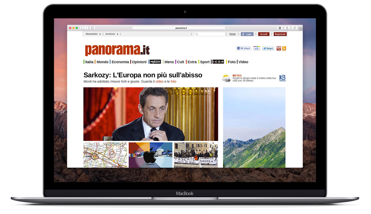
The Mondadori Wireframe and Donna Moderna projects were running in parallel and "feeding" each other. Therefore elements from the Wireframe project could be directly tested in a real product. The research findings from one project helped the other project and vice versa. Later on we also redesigned one of the largest news portals Panorama.it and Mondadori’s subscriptions website Abbonamenti.it.  

System adoption by 5+ assets

The Outcome

The adoption of the standard structure, elements and processes enabled faster and failure-proof design of future Mondadori’s websites. The Wireframe System was adopted by 5+ Mondadori’s assets.

You may also like:

Web site design Ana Rink © 2025