Briqs is a tool for designing professional responsive websites, with 20.000+ downloads in the Mac App Store.
Image
The project ran as a self-bootstrapped startup project, from 2013 till 2016. I was a co-founder and Lead Designer in this project.
A few years ago, driven by our own experience as web designers, we recognized the pain points faced in daily web development and decided to create an interface builder for ourselves. We knew that most professional design tools were built for printed media, not the web. They fundamentally fail to address the fluid nature of modern web interfaces or provide designs that truly adapt to different screen sizes.
The video explains the concept of Briqs App
Our research involved observing design and front-end development workflows, analyzing designer feedback across forums, and interviewing various web design professionals and amateurs. This work culminated in the creation of user personas, which revealed three primary user types with basic to advanced HTML/CSS skills.
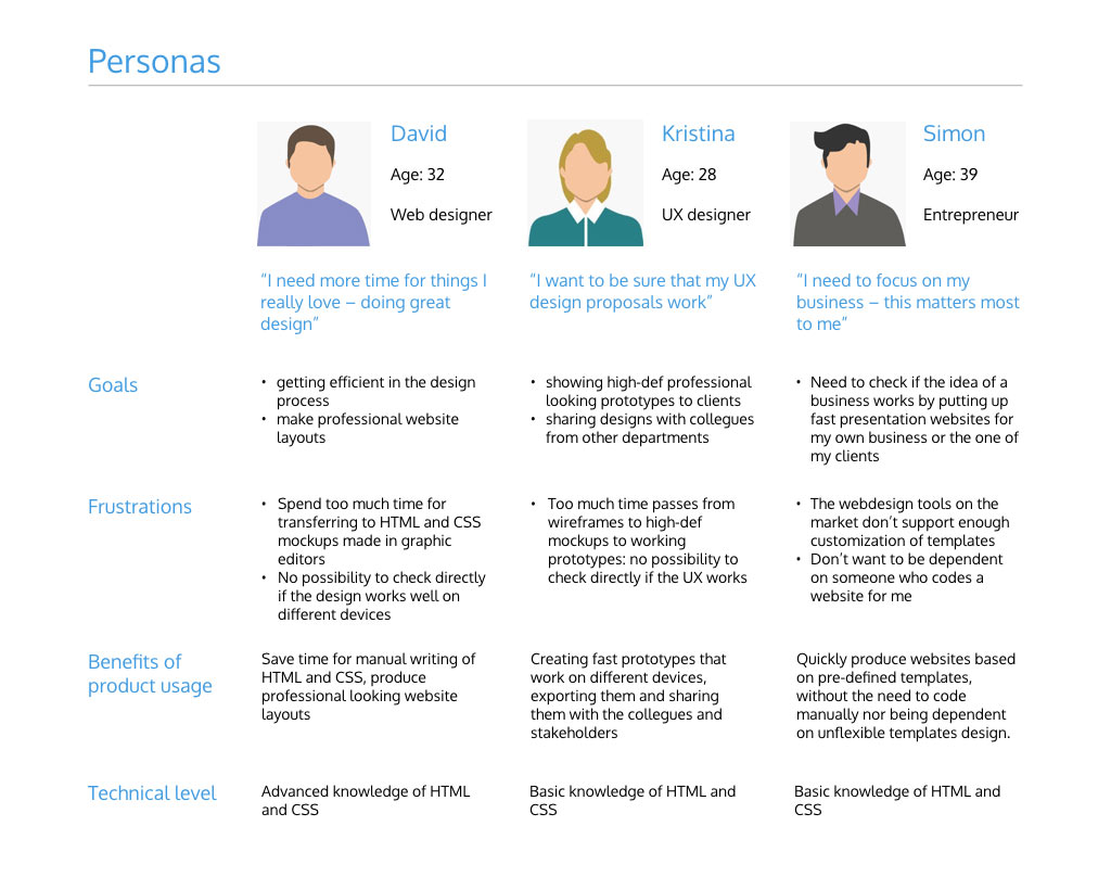
The core purpose of our web design tool was to smooth the friction and significantly accelerate the design and development cycle for all these user segments.
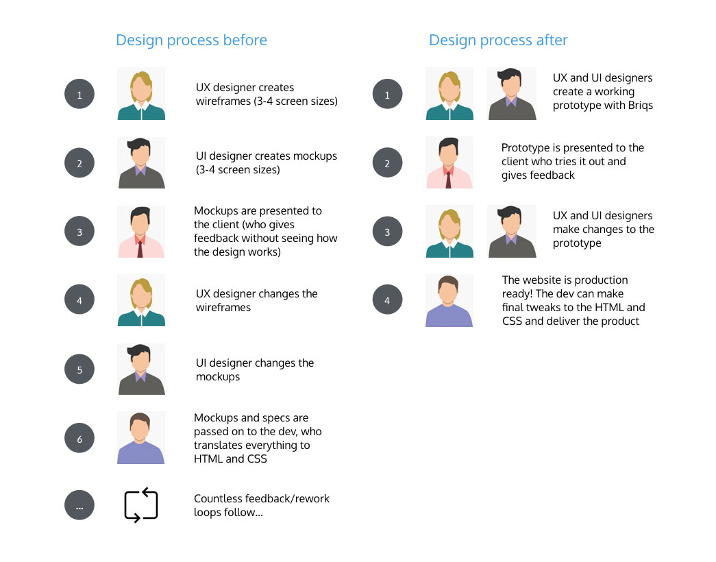
The traditional digital design process involves numerous stakeholders, multiple steps, and dozens of iterations. With Briqs, this process is significantly streamlined, saving time and reducing costly iterations for everyone involved.
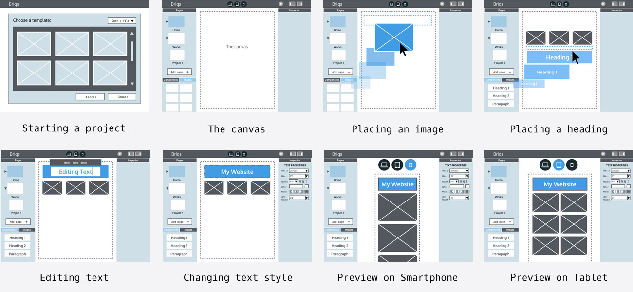
I began prototyping the tool by creating rough hand sketches and wireframes in Keynote, simultaneously documenting the user requirements. Given the tool's inherent complexity, it was crucial to clearly outline the most important functionalities and establish priorities early on.
Development and design ran in parallel with the UX work. We initiated the process with a simple prototype, which was then tested within our network of acquaintances and colleagues.
The testing phase clearly exposed the product's weak points. This required us to refine several UX aspects to ensure smoother interaction.
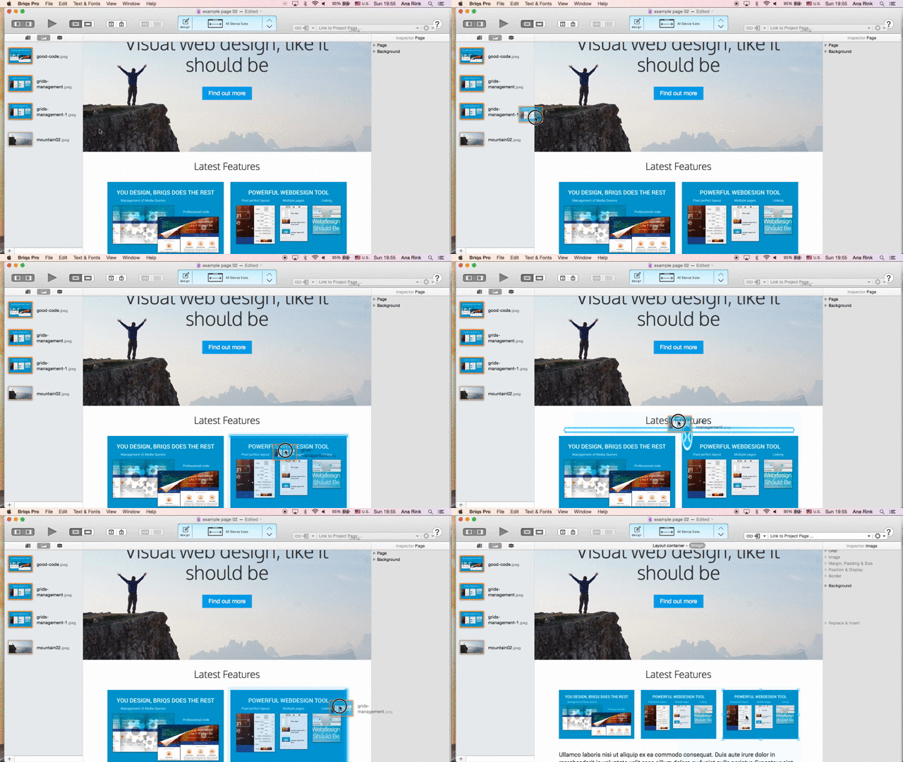
In Briqs, elements (such as text boxes and images) are stacked horizontally and vertically, directly mirroring the underlying structure of a web page. This interaction model is a radical departure from traditional graphical editors, where elements can be placed arbitrarily on a free-form canvas.
The animated hints shown while moving an element (see the picture) illustrate the responsive grid structure of the web page, where elements form columns and rows.
This innovative interaction model has been included in our US patent application:
System and method for semantics-concise interactive visual website design
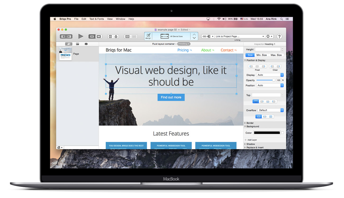
Briqs prioritizes the user's layout within the interface. The integrated layout engine provides a realistic, live rendering of the design, removing the necessity of hitting a preview button. Crucially, all on-screen elements maintain pixel-perfect fidelity with the final exported or published HTML page.
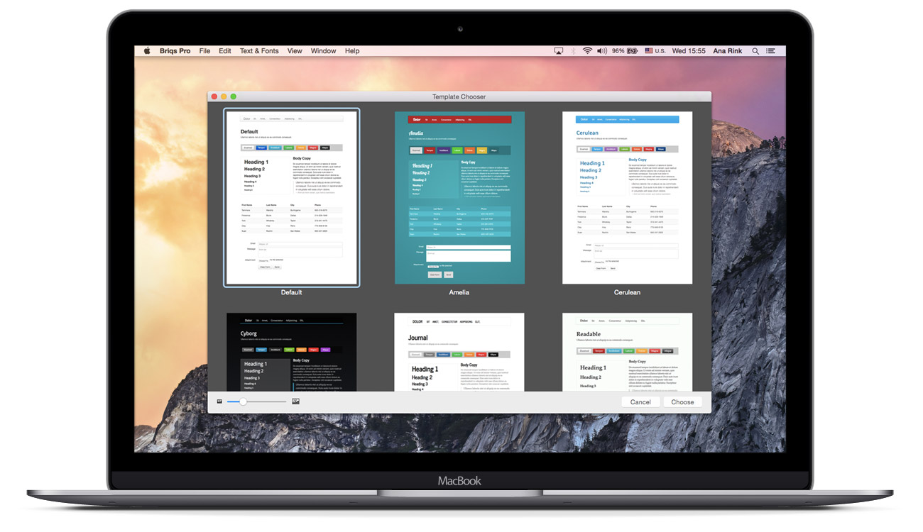
Users can initiate a project in Briqs by selecting from a library of 15 design templates. The chosen template then defines the project's overall style and foundational structure.
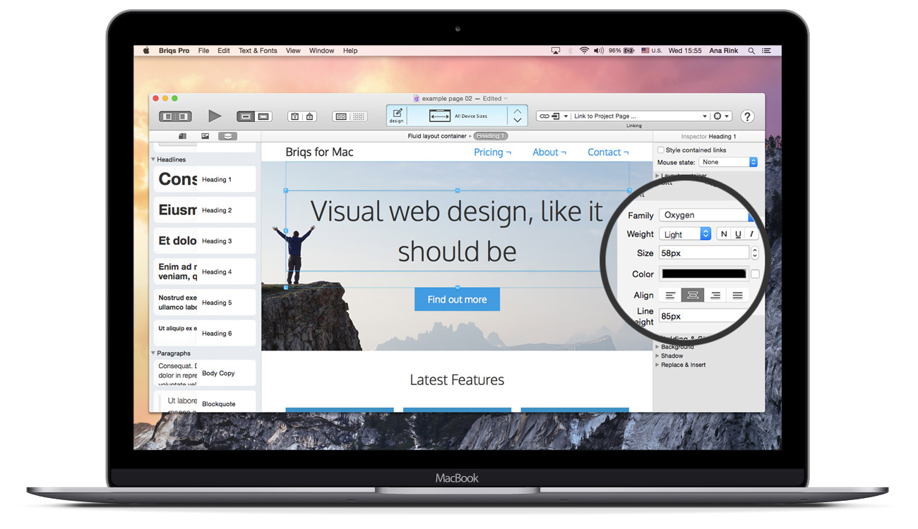
The majority of CSS properties are available within the style inspector, enabling the creation of professional, pixel-perfect layouts. This inspector provides an interface that will feel instantly familiar to Mac users who already work with applications like Pages or Keynote.
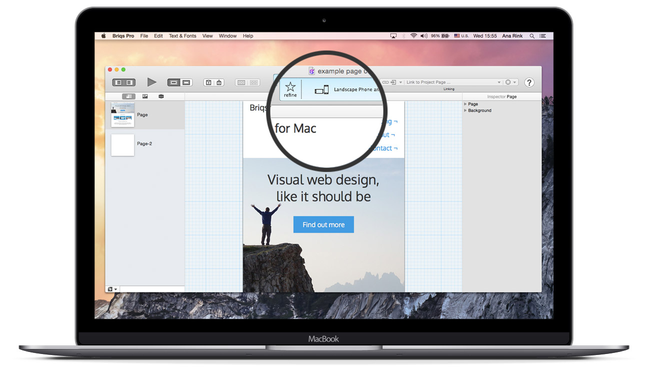
Since Briqs is built upon the Twitter Bootstrap responsive framework, it produces designs that adapt well to all screen sizes. Users can instantly preview the layout across different devices using the screen-size switch. Additionally, the interface supports a full-screen design mode achieved by toggling the left and right panels.
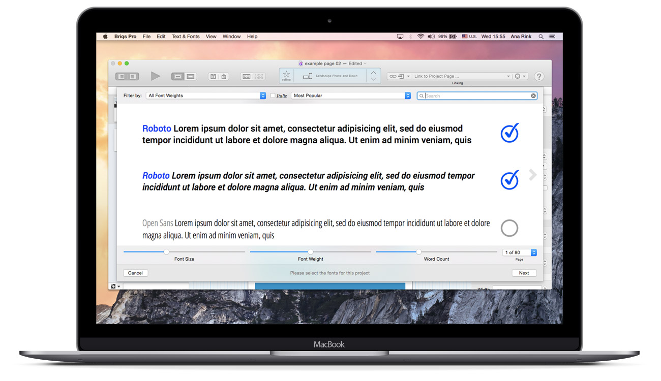
The integrated Google Fonts manager allows users to select from a vast variety of professional web fonts.
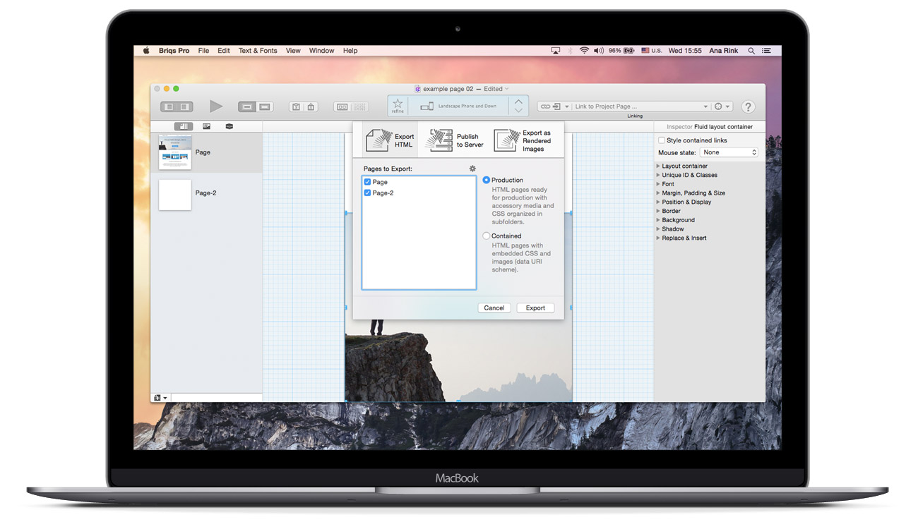
We provided flexible export options for project delivery: 1) Code Export - Exporting the project as clean HTML and CSS. 2) Direct Publishing: Publishing the project directly to a server. 3) Image Export: Exporting the layout as images, which is highly useful for UI/UX designers when sharing proposals with stakeholders.
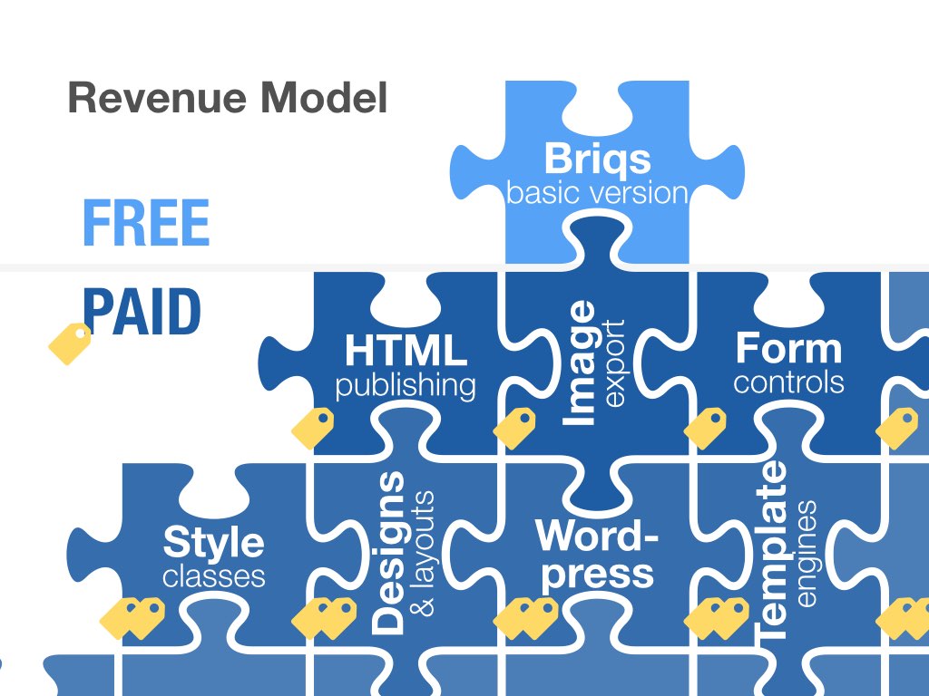
We selected a revenue model that enabled flexible future planning and flexible pricing: users pay only for the features they actively use. While this In-App Purchase model, typically associated with Mac App Store games, was a risky approach for a design application (most competitors offered all-inclusive licenses at the time), it proved to be highly promising and innovative.
We launched in November 2013 and achieved over 4,500 downloads within the first six weeks.
Briqs got chosen as finalists at Capital Factory’s “Move Your startup to Austin” competition and went to present Briqs at SXSW conference in Austin in March 2014. Briqs Pitch: Pitch deck for Briqs at SXSW Austin.
We received extensive feedback through our forum, alongside numerous reviews in the App Store. Here are some of the comments:
Managing a backlog of feature requests from our most vocal users, combined with new development and bug fixing, resulted in an ever-increasing workload. Unfortunately, this coincided with our lead developer securing a full-time position, which halted their continued work on Briqs. Consequently, development was put on hold from late 2015 to early 2016.
After nearly four years of bootstrapping, we achieved significant milestones: 20,000 downloads in the Mac App Store, features in numerous online magazines and blogs, and the filing of a US patent application: “System and method for semantics-concise interactive visual website design”. We also gained extensive user and market insights.
* This website was designed entirely in Briqs App.
Web site design Ana Rink © 2025